Just a quick note for a Weigh-In Wednesday this week.
I saw an add for Wix. Wix annoys me. They promote their services as "do it yourself for free," and try to convince people they can just build a wow-factor website in under 15 minutes at no cost.
Eight days later, most users have an incomplete website that looks like a 5th grader built it in 1998 using Microsoft Frontpage and Paint, and on this monstrosity there's a Wix advertisement in just about every corner that pops up whenever your mouse cursor gets within 30 pixels of it.
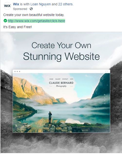
Today this add popped up:

Ok, build a "stunning" website? There's practically nothing on this website but one stunning photo. Is Wix suggesting all you DIY web designers are also professional photographers, or have access to FREE stunning photography stock? Because that's all that makes this website, and MOST websites visually appealing - the graphical or media content they are comprised of, which is where a whole lot of DYI web creators fall short.
Thanks, Wix, for your advice, and all your pop-up ads on your "free" websites.
If you want to work with cost effective, but professional web hosting providers, and design artists, then talk to me, and feel free to "skip" on Wix's 1:30 YouTube commercials.
BTW, the professionals can also help out with the stunning photography....